Web App
What is ApproveForMe?
ApproveForMe is a straightforward document approval tool that consolidates all feedback into one location. It simplifies the process of collecting and managing feedback on documents by allowing users to select a file from Google Drive, set details and deadlines, and send email requests to approvers. Approvers can then provide their feedback via a link without needing to sign in to the platform. This tool is perfect for creatives, sales teams, nonprofits, freelancers, startups, and teams looking to streamline their workflow and reduce the back-and-forth of traditional approval processes.
Problem Statement
The current document approval system within our organization is cumbersome, time-consuming, and error-prone, negatively affecting various stakeholders. Employees experience delays and confusion when tracking their submissions, while managers and approvers struggle with managing approval requests, causing bottlenecks and missed deadlines.
Administrative personnel are burdened with manual tracking and follow-ups, leading to decreased productivity and increased operational costs. This inefficiency not only frustrates employees and lowers morale but also poses risks of non-compliance with regulatory requirements and results in missed business opportunities due to delayed decision-making.
A streamlined, user-friendly document approval application is essential to address these challenges and improve efficiency, satisfaction, and compliance across the organization.
Solution
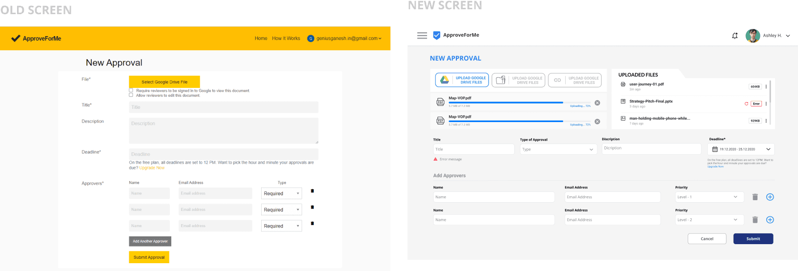
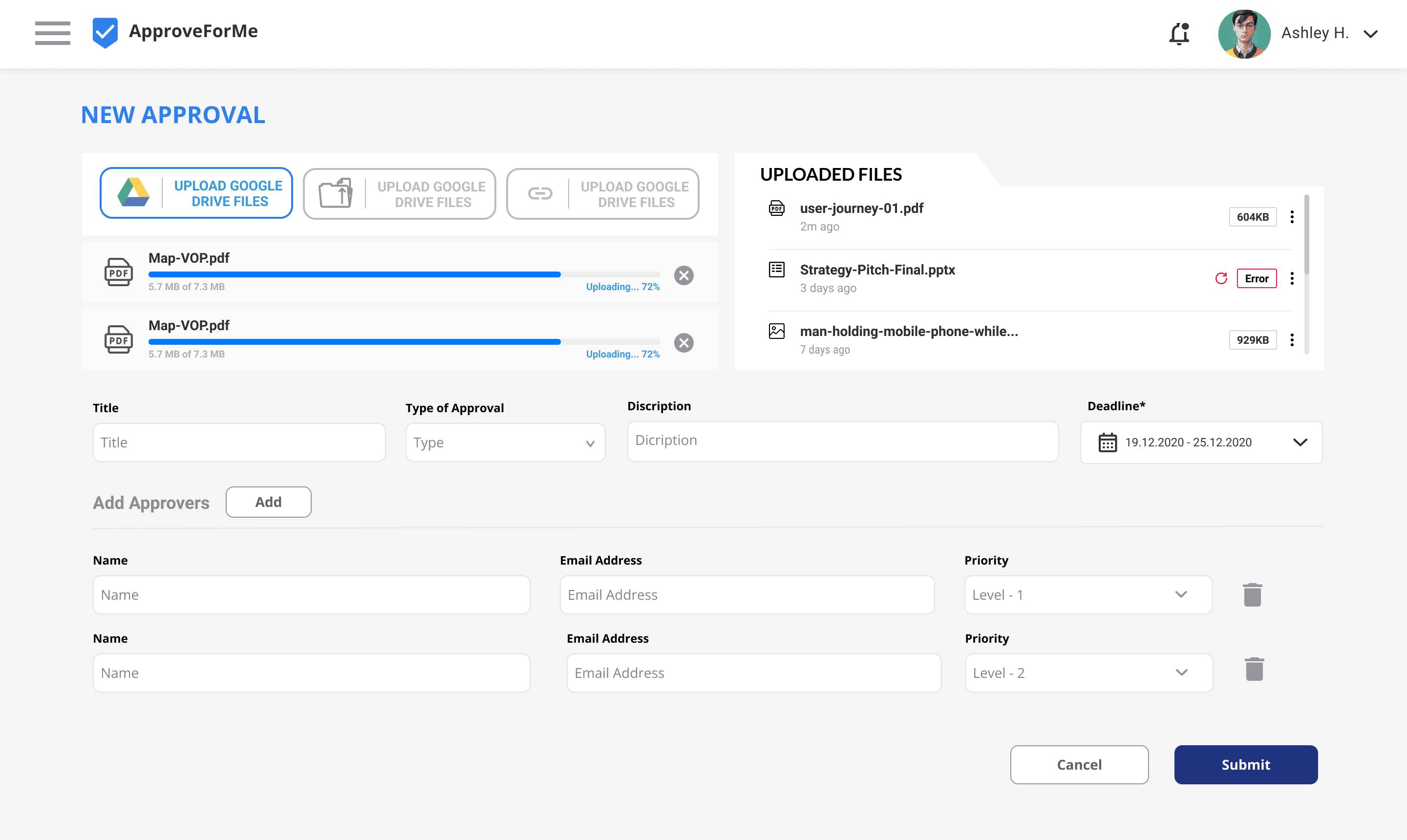
To address the issues in ApproveForMe and enhance the user experience, I implemented the following solutions: Streamline Navigation by using clear labels and a simplified menu structure;
Improve Visual Hierarchy by highlighting important elements and call-to-action buttons with contrasting colors and sizes;
Ensure Consistent Design with a cohesive system of standardized fonts, colors, and button styles;
Enhance Feedback Mechanisms by adding confirmation messages and progress indicators;
Simplify Processes by reducing the number of steps required to complete tasks and using progressive disclosure; Make Notifications Visible with a more prominent notification system;
Simplify Document Sharing by providing clear instructions and a streamlined interface;
How I reached there: The Story
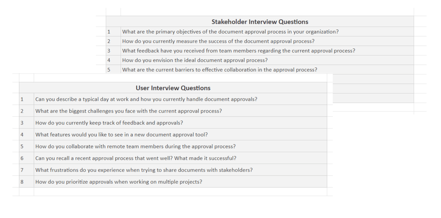
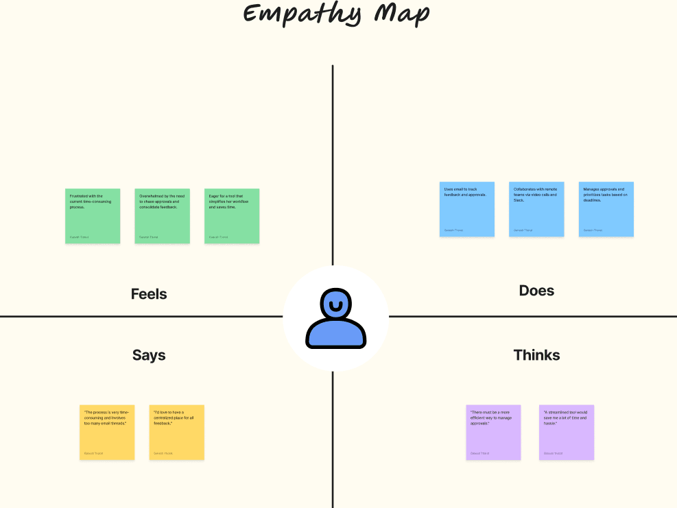
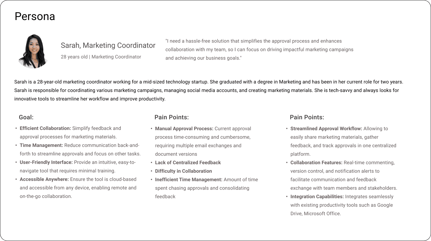
I began by analyzing user feedback and conducting interviews to understand their pain points, such as confusing navigation and inconsistent design. Inspired by UX principles like Jacob's Law and Gestalt Principles, I brainstormed and tested solutions on my own. I simplified the navigation, improved visual hierarchy, and enhanced feedback mechanisms. After implementing these changes, I rolled out the updated version, and soon, user satisfaction soared, validating my efforts and the importance of user-centered design.
My Role
Role: UX/UI Designer
I was responsible for analyzing user feedback, conducting usability testing, and implementing design improvements to enhance the user experience of ApproveForMe
Project Duration
3 Months
This project spanned over three months, during which I engaged in user research, prototyping, testing, and final implementation of design changes.
Team
While I took the lead on this project independently, I occasionally consulted with stakeholders for feedback and insights.
Tools Used :


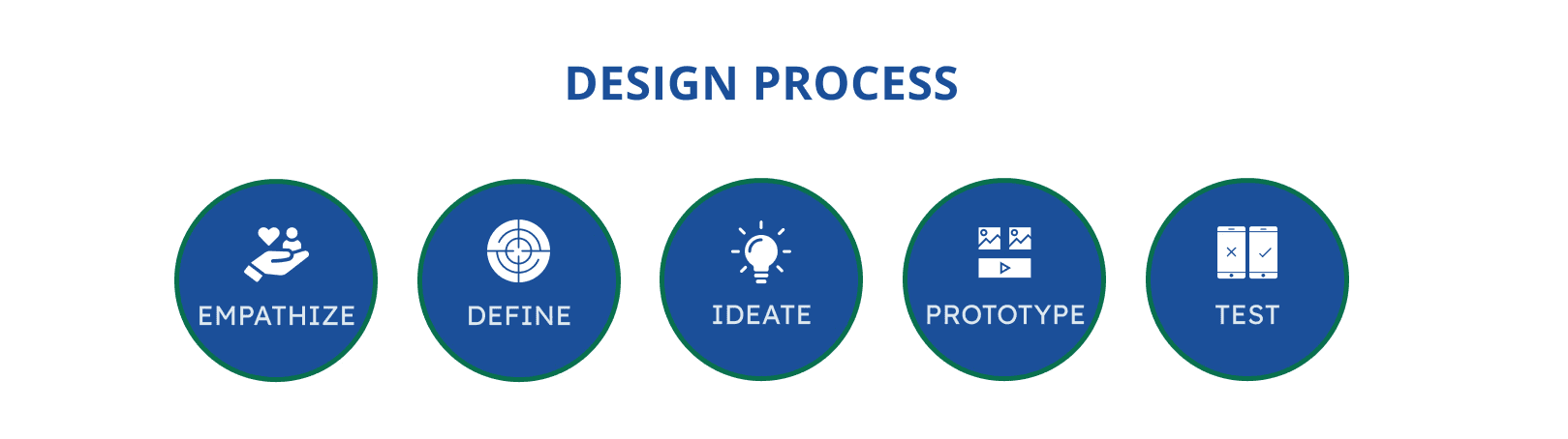
EMPATHIZE
DEFINE
IDEATE
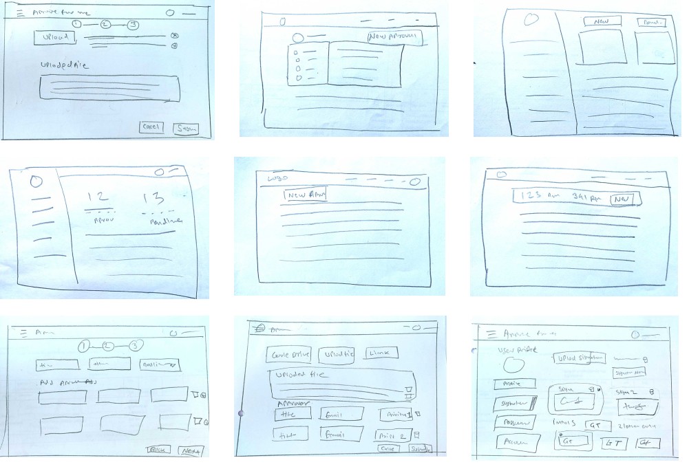
PAPER WIREFRAMES
Using the user flow structure, I drew sketches of the app’s main features first on paper.

TEST
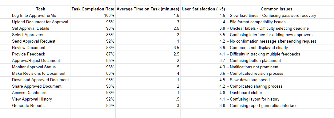

Summary of Usability Testing
The usability testing for ApproveForMe revealed several key insights into user interactions and pain points:
Navigation Issues: Users struggled with finding certain functions, indicating a need for clearer navigation and more intuitive layouts.
Task Complexity: Some tasks, like document revision and approval, were found to be more complex than expected, with users experiencing confusion around button placement and process flow.
Feedback and Notifications: Users expressed a need for more immediate feedback and clearer notifications about task statuses and confirmations.
Interface Design: Participants noted inconsistencies in design, such as varying button styles and unclear labels, leading to confusion and inefficiency.
Performance Concerns: Issues such as slow load times and download speeds were highlighted, suggesting a need for optimization to enhance user experience.
Overall Satisfaction: While the tool generally received positive feedback, specific areas for improvement were identified, focusing on simplifying the user interface and ensuring consistent and clear communication.