
Redesigning the HDFC Home Loan Experience
UX Case Study
Redesigning the HDFC Home Loan Experience
Transforming a data-heavy loan servicing experience into a customer-centered loan management platform.




Sector
Consumer Fintech
Target Audience
Existing Home Buyers
MORTGAGE LENDING STRATEGY
Why Improving the Home Loan Experience Matters
HDFC BANK AT A GLANCE
Market Leadership
India's largest private sector bank by market capitalization and customer base, setting industry benchmarks.
Post-Merger Scale
Following the HDFC-HDFC Bank merger, mortgage lending became one of the bank's largest retail businesses.
Digital Evolution
HDFC Bank continues investing in cutting-edge digital capabilities and intuitive customer self-service channels.
HOME LOAN MARKET OPPORTUNITY
₹33 Trillion+
Outstanding individual housing loan portfolio in India
14%
Housing loans' share of total credit in the financial system
15–16% CAGR
Expected housing finance market growth (FY25–FY30)
34.5%
Private bank’s market share of India's housing loan market
KEY USER CONTEXT
A 15 to 30-Year Lifelong Customer Journey
Home loans are long-term product’s lasting 15–30 years. Because these financial commitments span decades, customer touchpoints are continuous and highly repetitive. As a result, even minor digital friction points compound into major long-term customer dissatisfaction.
Frequent Critical Touchpoints Required by Customers:
EMI schedules
Outstanding balance
Interest certificates
Statements
Repayment progress
Service requests
PROJECT GOAL
Improve how customers understand, monitor, and manage their home loans through a clearer, action-oriented digital experience.
Why This Project?
Home loans are one of the longest financial relationships customers have with a bank.
Track EMI payments & interest changes
Monitor outstanding loan balance & tenure
Download interest certificates & tax statements
Request critical account-related services
Verify and update legal account information
15–30 years
Average home loan duration
Critical Friction
Current experience provides raw database information but requires significant customer cognitive effort to discover simple, daily answers.

UX Audit • Key Strengths
What Is Working Well?
Current strengths worth preserving in the upcoming HDFC mobile app redesign
Biometric Login
Provides rapid, friction-free access while maintaining banking security standards. Users log in under 2 seconds with high confidence.
SECURE ACCESS

Comprehensive Loan Info
Interest rates, outstanding principal, and tenure information are clearly consolidated. Minimizes support call volumes.
INFORMATION ARCHITECTURE

Self-Service Requests
Empowers customers to download interest certificates and tax documents instantly without visiting local branches.
UTILITY

Loan Progress Tracking
Visually maps application stages from submission to disbursement. Reduces user anxiety and transparency complaints.
TRANSPARENCY

Transaction Visibility
A clean, chronological log of past EMI debits and principal prepayments helps users verify statements instantly.
ACCOUNT AUDITING

Secure Banking Experience
In-app security alerts, session timeouts, and transaction limits reassure high-value mortgage loan borrowers.
TRUST

Screen Audit 01 — Login Experience
Evaluating the users first interaction with the Home Loan application.
Login Screen
9:41

Pain Points
1.
Multiple authentication options compete for attention, making the preferred login path difficult to identify.
2.
Primary and secondary actions receive similar visual weight, reducing action clarity.
3.
The screen contains substantial unused space that does not contribute to task completion.
4.
Alternative login methods are not grouped logically, increasing decision-making effort.
5.
Users must evaluate available options before taking action, creating unnecessary friction at the start of the journey.
User Impact
•
The first interaction requires users to interpret available actions rather than immediately proceed.
•
Users may spend additional time deciding which authentication method to use.
•
The login experience lacks a clear visual path toward successful account access.
KEY INSIGHT
"The application offers multiple authentication methods, but the lack of clear action hierarchy introduces unnecessary decision-making before users enter the experience."
Screen Audit 02 — Loan Details
Loan Account Overview
Login Interface

Screens captured from the existing HDFC Home Loan application.
Pain Points & Observations
1
The back navigation icon triggers logout-related functionality instead of supporting expected navigation behavior.
2
The View Details button has a small touch target, requiring precise interaction to access important loan information.
3
Breadcrumb information consumes valuable screen space while providing limited value within a simple mobile flow.
4
Users cannot understand their loan health at a glance because critical information is not available on the overview screen.
5
Users cannot quickly assess the health of their loan through a simple glance, increasing cognitive effort during repeat visits.
6
Account number, status, and loan amount receive similar visual importance, forcing users to read and interpret instead of immediately recognizing what matters.
7
The screen does not help users understand how much has been repaid, how much remains, or progress toward closure.
8
The floating action button does not clearly communicate its purpose, causing users to ignore it or hesitate before interacting.
User Impact
Users must navigate further to understand their loan position.
Basic loan-related questions remain unanswered on the overview screen.
Interaction effort increases for frequently performed tasks.
“
The overview screen provides account access but delivers limited decision-making value, requiring users to navigate deeper before understanding their loan status.
Screen Audit 03 — Loan Details
Evaluating how users understand their loan status after selecting "View Details".
Current Loan Details Screen
Insert Existing Screen Screenshot


Screen captured from the existing HDFC Home Loan application.
Pain Points & Observations
1
The page contains a high volume of information, making it difficult to identify what is most important.
2
Critical information such as outstanding balance, loan progress, and repayment status competes with secondary details.
3
Users need to scan multiple sections before understanding the current state of their loan.
4
Similar visual styling is used across all data points, reducing information prioritization.
5
Key loan metrics are spread across the page rather than summarized in a single location.
6
The experience focuses on displaying loan records rather than helping users quickly understand their financial position.
7
Users cannot answer common questions at a glance — How much have I repaid? How much is remaining? What do I need to do next?
8
A significant amount of reading is required before meaningful insights can be extracted.
User Impact
Increased cognitive effort.
Slower access to important loan information.
Difficult to quickly assess loan health during repeat visits.
“
The screen provides comprehensive loan information, but users must invest significant effort to identify and interpret the details that matter most to them.
Screen Audit 04 — Loan Details (Lower Section)
Evaluating transaction visibility, service discoverability, and navigation within the loan management journey.
CURRENT LOAN DETAILS (LOWER SECTION)
Insert Existing Screen Screenshot


Screen captured from the existing HDFC Home Loans application.
Pain Points & Observations
1
Recent transactions are positioned far below the primary loan information, requiring additional scrolling to access frequently referenced information.
2
The "View All Transactions" action has low visual prominence and can be easily overlooked.
3
Account services such as Interest Rate Changes, Online Payment History, and Pending Verification are placed below transaction content, reducing discoverability.
4
Information and actions are mixed within the same section, making it difficult for users to distinguish between viewing information and performing tasks.
5
The screen contains multiple navigation paths for transaction-related activities, creating uncertainty about where users should go next.
6
All service options receive equal visual emphasis, making it difficult to identify items that may require immediate user attention.
User Impact
Users must scroll to access important account activities.
Frequently used services become harder to find.
Additional effort is required to understand available actions.
Important account-related tasks may be overlooked.
“
Transaction information, account services, and navigation options are presented together without clear prioritization, increasing the effort required to discover and complete important tasks.
Screen Audit 05 — Request Menu
Analyzing how users discover and access loan-related services.
CURRENT REQUEST MENU SCREEN
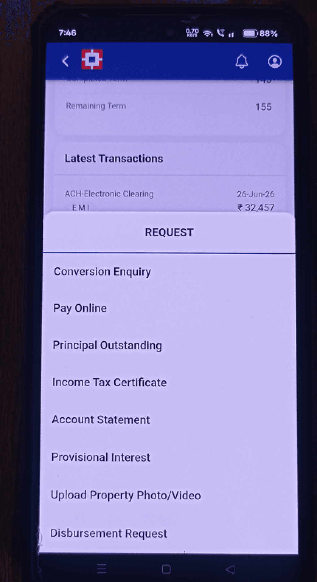
Screen captured from the existing HDFC Home Loans application.
Pain Points & Observations
1
Users are presented with a long list of services at once, making it difficult to quickly locate a specific request.
2
All menu options have equal visual weight, making it hard to distinguish frequently used services from less common ones.
3
Related services are not grouped into meaningful categories, forcing users to scan the entire list.
4
The experience relies heavily on reading, increasing effort for repeat users.
5
No search or quick-access mechanism is available despite the large number of request types.
6
Service naming uses internal banking terminology which may not align with how customers think about their tasks.
7
As additional services are added, discoverability and navigation complexity are likely to increase.
8
Several request options may no longer be relevant based on the customer's loan stage or account status. For example, some services may only be useful before disbursement or during specific stages of the loan lifecycle.
User Impact
Finding a specific request becomes time-consuming.
Users must evaluate every option before taking action.
Customers may overlook available self-service capabilities.
The experience lacks contextual relevance based on where customers are in their loan journey.
“
"The request catalog is extensive, but the lack of categorization, prioritization, and lifecycle-based relevance increases the effort required to discover and access services."
Screen Audit 06 — Outstanding Balance Journey
Evaluating how users access one of the most frequently requested loan details.
EXISTING OUTSTANDING BALANCE JOURNEY
A: Outstanding Balance Request


A: Outstanding Balance Request
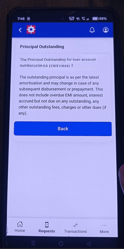


Visualizing the step-by-step transaction query on native HDFC mortgage platform.
Pain Points & Observations
1
Users must go through an intermediate selection step before viewing a simple loan balance.
2
The journey introduces additional decision-making that may not be necessary for customers with a single loan account.
3
The primary user goal is to know the outstanding amount, yet the flow focuses on process completion before delivering the answer.
4
After reaching the result page, the key value (outstanding amount) competes with explanatory content and supporting text.
5
Users need to read large content blocks to locate the information they actually came for.
6
The result screen provides information but offers limited guidance on what users can do next.
7
A simple information lookup turns into a multi-step journey, increasing effort for a high-frequency task.
User Impact
Additional time is required to access a single piece of information.
Important financial details are harder to identify than expected.
Users must interact with multiple screens to accomplish a straightforward goal.
The journey feels process-driven rather than goal-driven.
“
Key Insight: Customers seeking a single financial value are required to complete multiple steps and interpret large amounts of content before reaching their answer.
Key Findings from the Existing Experience Audit
Reviewing recurring usability issues identified across key loan-management journeys.
01
Information Hidden Behind Navigation
Users must navigate multiple screens before accessing important loan information.
02
Weak Information Hierarchy
Important financial details compete with secondary information for attention.
03
High Cognitive Effort
Users need to read and interpret excessive content before understanding their loan status.
04
Poor Service Discoverability
Request-related services require extensive scanning to locate.
05
Low Action Visibility
Important actions such as View Details and View All Transactions have limited prominence.
06
Generic Experience
The application presents identical options regardless of the customer's loan stage or needs.
07
Process Over Goals
Many journeys focus on completing banking processes rather than helping users achieve their goals quickly.
08
Limited Decision-Making Support
The application displays data but provides limited context to help users understand what matters most.
“
Core Insight: The product successfully surfaces loan-related information and services, but users must invest significant effort to locate, interpret, and act on the information they need.
Voice of Customer
Understanding customer frustrations and expectations through Play Store feedback.
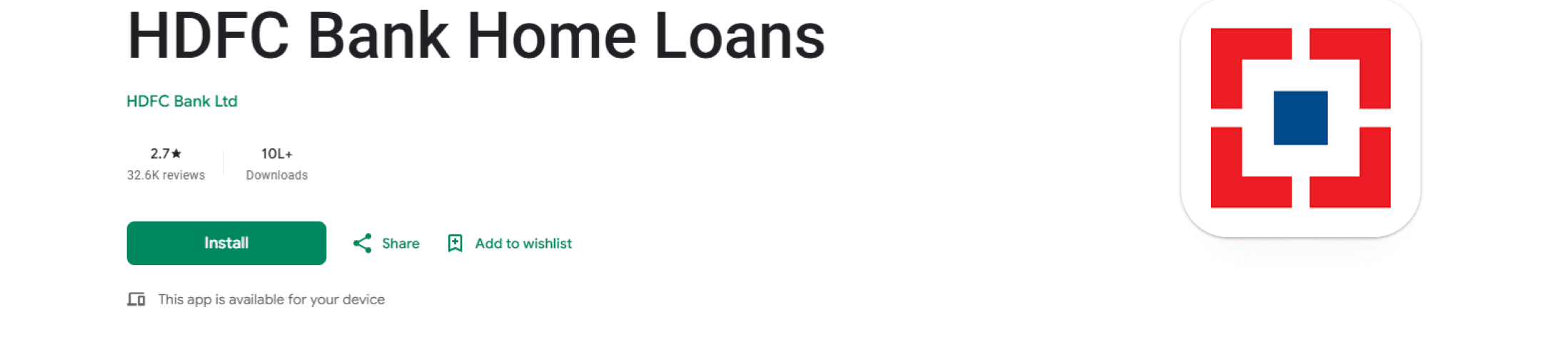
App Store Snapshot
⭐
2.7
Average Rating
📝
32.6K
Total Reviews
⬇️
10L+
Active Downloads
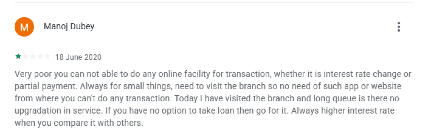
What Customers Are Saying




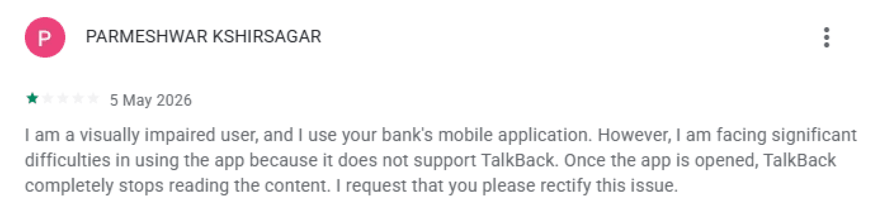

Recurring Themes
Missing Core Functionality
Users expect essential loan servicing actions to be available digitally.
Difficult Loan Management
Customers struggle to complete important loan-related tasks efficiently.
Information Transparency
Users want easier access to loan status, outstanding balance, and repayment information.
Competitive Experience Gap
Customer expectations are increasingly shaped by modern banking experiences.
“
Research Insight: Customer feedback consistently highlighted challenges around usability, loan servicing capabilities, and information accessibility. These concerns closely aligned with findings identified during the product audit.
Research Evidence & Industry Insights
Industry reports, market studies, and customer experience research reviewed during the discovery phase.
01 • Home Loan Digitization
Modern borrowers expect frictionless, transparent, and digital-first lending systems. The demand for end-to-end self-service portals is growing exponentially.
Source & Publication
McKinsey & Co. Global Banking Report
Retail Banking Insights • 2025
https://mck.co/home-loan-tech-25
02 • Banking Experience Trends
Customer loyalty in digital banking is increasingly driven by system speed, usability, and instant clarity of financial information rather than standard product options.
Source & Publication
Gartner Financial Services Study
CX Benchmarking Report • Q3 2025
https://gartner.com/financial-cx-index
03 • Service Transparency
Visible real-time status tracking and transparent communication directly correlate with positive customer trust scores during multi-week loan cycles.
Source & Publication
Journal of Financial Services
Trust & Transparency Survey • 2024
https://jfsm.org/transparency-trust
04 • Digital Lending Evolution
Legacy servicing frameworks continue to cause user drop-offs due to process fragmentation. Transitioning to goal-oriented architectures solves discovery challenges.
Source & Publication
Forrester Research Platform Guide
Retail Banking Servicing Map • 2025
https://forrester.com/digital-lending-map
Research Repository
McKinsey Global Banking Report
Retail Banking Insights • 2025
mck.co/banking-report-2025
Gartner Financial Services Study
CX Benchmarking • Q3 2025
gartner.com/cx-study-25
Journal of Financial Services
Trust & Transparency Survey • 2024
jfsm.org/trust-survey-2024
Forrester Research Guide
Servicing Journey Map • 2025
forrester.com/retail-servicing
Key Themes Emerging From Research
Digital Self-Service
Transparency & Visibility
Experience-Led Banking
Simplified Customer Journeys
“
Research Synthesis: A review of industry reports, academic research, and banking experience studies highlighted recurring themes around customer expectations, self-service capabilities, transparency, simplicity, and digital-first servicing experiences.
Primary Persona
Rajesh Sharma

Rajesh Sharma
Primary Persona
🎂
Age: 38
💼
Occupation: Senior IT Professional
📍
Location: Pune
👨👩👦
Family: Married, 1 child
🏠
Loan Tenure: 20 Years
📱
Digital Banking User: Digital First
Background
Rajesh regularly uses mobile banking apps to manage his finances. He prefers self-service solutions and expects quick access to important loan information without contacting support.
"
I don't want all the loan details. I just want to know what's important and what I need to do next.
✓
Goals & Objectives
✓
Track outstanding loan balance seamlessly
✓
Monitor upcoming EMI payments and schedules
✓
Access interest statements and tax certificates directly
✓
Complete routine loan-related service requests independently
✓
Understand overall repayment progress easily
✗
Pain Points & Frustrations
✗
Important loan metadata is buried and difficult to locate
✗
Too many disjointed screens required to complete simple updates
✗
Acoustics of financial information feels complex and overwhelming
✗
Standard service requests require extensive navigation and searching
✗
Unclear banking terminology makes self-service confusing
•
Key Behaviors & Habits
Checks current loan outstanding balance once or twice per month
Downloads year-end statements primarily during tax filing season
Heavily favors mobile-first banking flows over desktop alternatives
Prefers immediate action-oriented summaries over exhaustive detail reports
Current State User Journey
How Rajesh currently manages his home loan using the HDFC Home Loan app.
RS
Rajesh Sharma
Age: 38 | Senior IT Professional
Primary Goal
Quickly track and manage his home loan.
User Mindset
"I don't want all the loan details. I just want to know what's important and what I need to do next."
Stages
01
Login
02
View Loan Account
03
Review Loan Details
04
Access Services
05
Check Outstanding Balance
06
Complete Loan Task
User Goal
Access account quickly
Understand loan status
Track repayment progress
Find required service
Know remaining balance
Finish task independently
Actions
Authenticate using MPIN/Biometric
Open account summary
Review loan details
Browse request menu
Submit request
Read result/information
Thoughts
"Let me quickly access my loan."
"Can I see my current status?"
"Which information matters most?"
"Where is the option I need?"
"Why are there so many steps?"
"I finally found it."
Pain Points
• Multiple actions compete for attention
• Missing key loan insights
• Information overload
• Excessive scanning
• Long service list
• Poor discoverability
• Multi-step process
• Important information buried
• Low task efficiency
Opportunities
Captured for later design phase
Captured for later design phase
Captured for later design phase
Captured for later design phase
Captured for later design phase
Captured for later design phase
😊
Stage 01
😐
Stage 02
😕
Stage 03
😣
Stage 04
😫
Stage 05
😑
Stage 06
User Effort Increases Throughout The Journey
“
Key Journey Insight: The experience becomes increasingly effortful as users move deeper into common loan-management activities, requiring additional navigation, scanning, and decision-making to accomplish simple goals.
Competitor Analysis
Understanding industry benchmarks and customer expectations for digital home loan management.
Comparison Criteria
HDFC Home Loans
ICICI iMobile
SBI YONO
Axis Mobile
1. Loan Dashboard Clarity
⚠️ Partial
✅ Available
✅ Available
2. Outstanding Balance Visibility
❌ Missing
✅ Available
✅ Available
⚠️ Partial
3. Loan Progress Tracking
❌ Missing
✅ Available
⚠️ Partial
✅ Available
4. Part-Payment Support
⚠️ Partial
✅ Available
✅ Available
✅ Available
5. Statement Accessibility
⚠️ Partial
✅ Available
✅ Available
✅ Available
6. Service Discoverability
❌ Missing
✅ Available
⚠️ Partial
✅ Available
7. Navigation Simplicity
❌ Missing
✅ Available
✅ Available
⚠️ Partial
8. Self-Service Experience
⚠️ Partial
✅ Available
⚠️ Partial
✅ Available
9. Quick Actions
❌ Missing
✅ Available
✅ Available
✅ Available
10. Task Completion Efficiency
❌ Missing
✅ Available
⚠️ Partial
✅ Available
Legend:
✅
Available
⚠️
Partial
❌
Missing
Key Competitive Insights
1
Competitors surface critical loan information earlier in the journey.
2
Leading banking apps reduce the number of steps required for common loan-management tasks.
3
Self-service capabilities are more discoverable in competitor experiences.
4
Competitors provide stronger visibility into loan progress and repayment status.
5
Customer expectations are increasingly influenced by modern banking experiences rather than traditional loan servicing portals.
Areas Where HDFC Falls Behind
Information Visibility
Customers require multiple interactions before accessing important loan details.
Service Discovery
Users spend additional effort locating loan-related services.
Digital Loan Management
Customers expect greater control over loan activities directly within the app.
“
Research Insight: Competitive benchmarking revealed that users increasingly expect quick access to loan information, simplified service journeys, and self-service capabilities as standard banking experiences.
Research Findings & Key Insights
Synthesizing insights from the UX Audit, Customer Reviews, User Journey Mapping, and Industry Benchmarking.
01
Users Need Answers, Not Data
Customers primarily visit the app to quickly understand their loan status, outstanding balance, EMI information, and repayment progress. However, important information is distributed across multiple screens and data-heavy interfaces.
02
Navigation Effort Increases Task Completion Time
Users must navigate through multiple screens before reaching meaningful information or completing common loan-management tasks.
03
Service Discovery Requires Excessive Scanning
The request menu contains numerous options with equal priority, forcing users to read and evaluate each service before taking action.
04
Information Overload Impacts Understanding
Critical loan information competes with secondary financial details, increasing cognitive effort and reducing scannability.
05
Customers Expect Self-Service Control
Play Store reviews and industry benchmarks indicate that customers expect easy access to loan-related actions, documents, and account services through digital channels.
06
The Experience Is Process-Driven
Many journeys are structured around banking processes rather than helping users achieve their goals efficiently.
“
Key Research Insight: "The core challenge is not the lack of information or services. The challenge is helping customers quickly find, understand, and act on what matters most throughout their loan journey."
Research Scope:
✓
Existing Product Audit
✓
Play Store Review Analysis
✓
Persona
✓
User Journey Mapping
✓
Competitor Analysis
Problem Statement
Defining the core challenge uncovered during research.
The Challenge
Customers use the HDFC Home Loans app to manage their loans, track repayments, access statements, and complete loan-related services. However, completing these tasks often requires navigating multiple screens, scanning large amounts of information, and interpreting complex financial content before reaching meaningful answers.
Problem Statement
"Home loan customers struggle to quickly find, understand, and act on important loan-related information because critical details are spread across multiple screens, services are difficult to discover, and information is presented in a way that requires significant effort to interpret."
User Impact
•
Important loan information is difficult to access.
•
Simple tasks require unnecessary navigation.
•
Users spend time searching instead of managing their loan.
•
Cognitive effort increases throughout the journey.
Business Impact
•
Reduced self-service adoption.
•
Increased dependency on customer support.
•
Higher task abandonment risk.
•
Lower customer satisfaction with digital servicing channels.
“
Problem Summary: "The experience contains the information customers need, but not in a way that supports quick understanding, decision-making, and task completion."
Prioritizing the Right Problems
Not every issue discovered during research could be addressed. To maximize user value and business impact, opportunities were prioritized using an Impact vs Effort framework.
HIGH
I
M
P
A
C
T
LOW
HIGH IMPACT / LOW EFFORT
1
•
Surface key loan information on overview screen
•
Improve information hierarchy
•
Increase visibility of important actions
•
Remove irrelevant service options
HIGH IMPACT / HIGH EFFORT
2
•
Redesign service discovery experience
•
Create goal-based loan management flow
•
Personalized experience based on loan lifecycle
LOW IMPACT / LOW EFFORT
3
•
Improve button touch targets
•
Reduce unnecessary labels and breadcrumbs
•
Content cleanup
LOW IMPACT / HIGH EFFORT
4
•
Advanced personalization
•
Predictive assistance
•
AI-powered recommendations
LOW
EFFORT
HIGH
Prioritization Criteria
1. User Impact
How significantly does the issue affect customer experience?
2. Frequency
How often does the issue occur?
3. Business Value
Will solving it improve self-service adoption and customer satisfaction?
4. Implementation Effort
Level of design and development effort required.
“
Key Decision: "The redesign focused first on improving information visibility, reducing cognitive effort, and helping customers complete common loan-management tasks more efficiently."
Design Principles
Guiding principles used to drive redesign decisions.
01
Prioritize What Matters Most
Surface critical loan information first so users can quickly understand their financial position without extensive navigation or scanning.
02
Reduce Cognitive Effort
Present information in a way that is easy to scan, understand, and act upon, minimizing unnecessary reading and interpretation.
03
Support Goal-Oriented Tasks
Design experiences around customer goals rather than internal banking processes.
04
Improve Discoverability
Make important services, actions, and information easier to find throughout the loan journey.
How Research Informed Design
Research Findings
Design Principles
Design Decisions
Improved Customer Experience
“
Design Direction: "Rather than introducing new functionality, the redesign focused on improving visibility, discoverability, navigation efficiency, and task completion."
Task Flow Redesign
Simplifying the journey to access outstanding loan information.
Current Flow
BEFORE
6 Steps
Login
Loan Account
Loan Details
Request Menu
Outstanding Selection
Outstanding Result
Challenges
• Multiple navigation steps required to find balance
• Requires unnecessary decision-making at each stage
• Important information hidden deep behind requests menu
• Users must navigate before reaching their primary goal
Improved Flow
AFTER
3 Steps
Login
Loan Dashboard
Outstanding Balance
Benefits
• Faster, seamless access to critical loan details
• Reduced navigation effort with clear page hierarchy
• Improved task efficiency for daily operational users
• Goal-focused experience without distracting loops
Task Steps
6
3
Navigation Effort
High
Low
Information Accessibility
Low
High
“
Key Design Decision: "The redesign focused on reducing the number of interactions required to access high-priority loan information, helping users achieve their goals faster."
How Might We...
Reframing research findings into design opportunities.
Based on insights gathered from the product audit, customer reviews, user journey mapping, and industry benchmarking, the following How Might We statements were created to guide the design exploration phase.
01
How might we help customers understand their loan status at a glance without navigating through multiple screens?
02
How might we surface the most important loan information before secondary details?
03
How might we reduce the effort required to find and access loan-related services?
04
How might we help customers complete common loan-management tasks more efficiently?
05
How might we make the experience feel more goal-oriented rather than process-oriented?
06
How might we provide customers with greater visibility and control throughout their loan journey?
“
Design Direction: "The focus is not to add more features, but to improve how customers find, understand, and act on existing information and services."
Information Architecture Redesign
Simplifying navigation and improving access to important loan-related information.
Existing Structure
BEFORE
Home
Loan Account
Loan Details
[Transactions • Requests • Outstanding Balance buried deep]
Critical Issues Identified
•
Important loan status buried 4+ taps deep
•
Service and certificate requests extremely difficult to discover
•
Repetitive, high cognitive load navigation steps
•
Related data (EMI, balance, statements) fragmented across tabs
Proposed Structure
AFTER
Dashboard
Outstanding Balance
Next EMI
Loan Progress
Recent Activity
Services
Statements
Certificates
Payment History
Loan Requests
Profile & Support
Help Center, Profile Settings
Redesign Outcomes
•
Instant (1-tap) visibility for key outstanding balance
•
Clean structural boundary separating pure info and service actions
•
Discoverable document requests without menu traversal
•
Drastically minimized average steps to perform critical workflows
“
IA Strategy: "The information architecture was reorganized around customer goals rather than banking processes, helping users find information and services more efficiently."

UX Portfolio Case Study
Solution Phase
Before vs After
How the redesigned experience improves access to key loan information and services.
Current
Data & Process Focused
Redesigned
Goal-Oriented & Actionable
BEFORE
Current Fragmented Experience


01
Important loan information hidden
02
Multiple screens required to complete tasks
03
Long request list difficult to scan
04
Users need to search for information
05
Services lack logical categorization


AFTER
Proposed Reimagined Experience
01
Critical loan information visible immediately
02
Reduced navigation depth (5 to 2 screens)
03
Services organized by clear user goals
04
Improved service discovery & accessibility
05
Faster end-to-end task completion
Key UX Improvements
Navigation Depth
5 Screens
2 Screens
Information Visibility
Low
High
Service Discoverability
Low
High
User Effort
High
Reduced
OUTCOME
The redesign consolidates fragmented information, reduces navigation effort, and helps customers understand and manage their loans from a single, centralized experience.
Final Solution Overview
Reimagining the home loan experience around customer goals.
Information Visibility
•
Important loan details surfaced upfront
•
Reduced information hunting
•
Quick access to loan health
Simplified Navigation
•
Reduced navigation depth
•
Improved service discoverability
•
Faster access to high-frequency tasks
Goal-Oriented Experience
•
Prioritized user goals
•
Reduced interaction effort
•
Focused on task completion
BEFORE
Current Experience (Information Heavy)
PROPOSED
Action-Oriented Experience
Redesign Focus Areas
Loan Dashboard
Loan Details
Service Discovery
Outstanding Balance Journey
Solution Strategy: "The redesign focused on helping customers quickly understand their loan status, access important services, and complete common loan-management tasks with minimal effort."
Expected Impact
How the redesigned experience addresses key customer pain points.
Problems Addressed
Expected Outcomes
01
Important loan information spread across multiple screens.
01
Unified dashboard centralizes critical loan information.
02
Users needed multiple navigation steps to understand loan status.
02
Reduced navigation depth through dashboard-first architecture.
03
Outstanding balance buried inside request flows.
03
Outstanding balance immediately visible after login.
04
Service discovery required excessive scanning.
04
Categorized service hub improves discoverability.
05
Users needed to interpret large amounts of financial information.
05
Visual hierarchy and smart recommendations reduce cognitive load.
Design Impact: Each redesign decision directly addresses a validated user pain point, ensuring measurable improvement in the home loan management experience.
Key Learnings & Reflection
Insights gained throughout the redesign process.
What I Learned
01
Information visibility is a bigger problem than missing functionality.
Many services already existed within the app, but users struggled to discover and access them efficiently.
02
Users visit loan applications to answer a few critical questions.
How much do I owe? When is my next EMI? What should I do next?
03
More information does not always create better experiences.
Prioritization, hierarchy, and clarity are often more valuable than additional details.
04
Reducing navigation effort can significantly improve usability.
Centralizing information helps users complete tasks with less effort.
Project Reflection
Research-Driven Decisions
Customer reviews and product audit findings consistently pointed toward navigation and discoverability challenges.
Balancing Business & User Needs
The redesign aimed to improve usability while preserving essential banking functionality.
Designing for Real-World Usage
The focus shifted from displaying data to helping customers complete common loan-management activities.
Future Opportunities
Potential future areas include personalized recommendations, smart reminders, and advanced loan insights.
“
Great financial experiences are not defined by how much information they provide, but by how quickly customers can understand and act on what matters.
Final Reflection: This project demonstrated how improving information hierarchy, discoverability, and task efficiency can transform a data-heavy banking experience into a more customer-centered loan management platform.
Thank You
Redesigning the HDFC Home Loan Experience
Transforming a data-heavy servicing experience into a customer-centered loan management platform.
Research
→
Insights
→
Strategy
→
Redesign
→
Better UX
“
Good design helps users focus less on finding information and more on achieving their goals.
UX Audit
Customer Review Analysis
Journey Mapping
Competitor Benchmarking
Information Architecture
Mobile Experience Redesign
Designed by
Ganesh Thorat
UX Case Study · 2026